20 on 20
20th Anniversary Exhibition
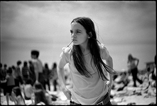
Priscilla, Jones Beach, 1969 – Joseph Szabo
It was the summer of 1969 and I went to Jones Beach on Long Island with my camera. As I stepped onto the beach, there before my eyes was this young girl with a cigarette. Without hesitation I automatically raised my camera focused quickly and took two shots. Not sure that I had the correct settings (f-stop, shutter speed) I looked down to make sure they were correct. When I looked up, the girl was gone, nowhere to be seen on the beach or boardwalk. After returning home, I processed the film and saw to my surprise that I had one good
frame that I printed in my darkroom. A few years later, in my art class students were looking at photo magazine to find images that they could use as an idea for a painting. One of the students saw my photo in the magazine and remarked, “…Hey Priscilla, there is a photo that looks just like you in this magazine…”. So that is how I came to title my photo ‘Priscilla’. Throughout the 1970’s I never saw ‘Priscilla’ again at Jones Beach.
RK – This was the photograph in the window of the first ever exhibition at the gallery in July 2005. The exhibition, ‘Young Americans’ was a two-hander featuring the works of Joseph Szabo from his ‘Teenage’ series and Terry Richardson’s ‘Terryworld’-era works. The exhibition was only possible thanks to Michael Hoppen, who was both a massive inspiration and a massive help in the first few years of setting up the gallery. We had such an amazing reaction to ‘Priscilla’, it’s a sublime, almost dream-like image with the out-of-focus figures in the background and this age-less girl lifting up her trousers, cigarette cooly held between her lips. Despite all the nudity on display in the exhibition, this is the image that I received so much opprobrium for from passing audiences in Brighton.
Horse Mountain, 2006 – Tim Flach
For me, Horse Mountain evokes both a snow-covered peak and something unmistakably equine. With just a white shoulder and mane against a black background, it offers a quiet nod to modernist architect Mies van der Rohe’s belief that “Less is More.” If we had more horse, would the magic disappear? Conversely, if we had less, would we simply be observing a couple of hairs? It is that space in between that invites reflection.
RK – One of the first ever shows at the gallery was our first collaboration with Tim Flach. ‘Equus’ the exhibition took place in 2006 and this was the image produced large to go in the gallery window. I remember how it stopped people in their tracks, making them double-take, unsure what it was they were looking at, at first a snowy mountain revealing itself to be something more detailed and complex, and then the realisation. The series was a huge success, which continued with Tim’s appearance and prints being featured as one of the sales challenges on BBC’s ‘The Apprentice’ and the subsequent publication of his first encyclopaedic species book in 2008.

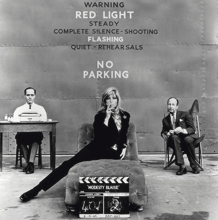
Monica Vitti, on the set of ‘Modesty Blaise’, Shepperton Studios, 1965 – Terry O’Neill
In 1966, Terry O’Neill was invited to take photos on the set of the film ‘Modesty Blaise’, starring Italian actress Monica Vitti. Vitti only made two English-language films in her career. Her first, the spy-spoof adaptation of a popular comic strip, cast her as Modesty Blaise opposite two of the most important leading men in Britain, Terence Stamp and Dirk Bogarde.
In this iconic photograph, Vitti poses with a clapperboard alongside the author of the Modesty Blaise book, Peter O’Donnell and film producer Joseph Janni.
RK – Every year we put on a show entitled ‘Eclectica’, featuring works by artists new to the gallery and favourites from shows of that year. We showed Terry O’Neill’s work at the first exhibition of this kind in 2005 and what a reaction we had. An amazing body of work from an era that allowed an intimacy between photographer and celebrity subject never to be seen again. Although we never sold a print of this, it is my favourite image by Terry, and always reminded me of my mum, a Bolton-born Monica Vitti! I got to meet Terry a couple of times and he was as charming and easy-going as his images would lead you to expect.
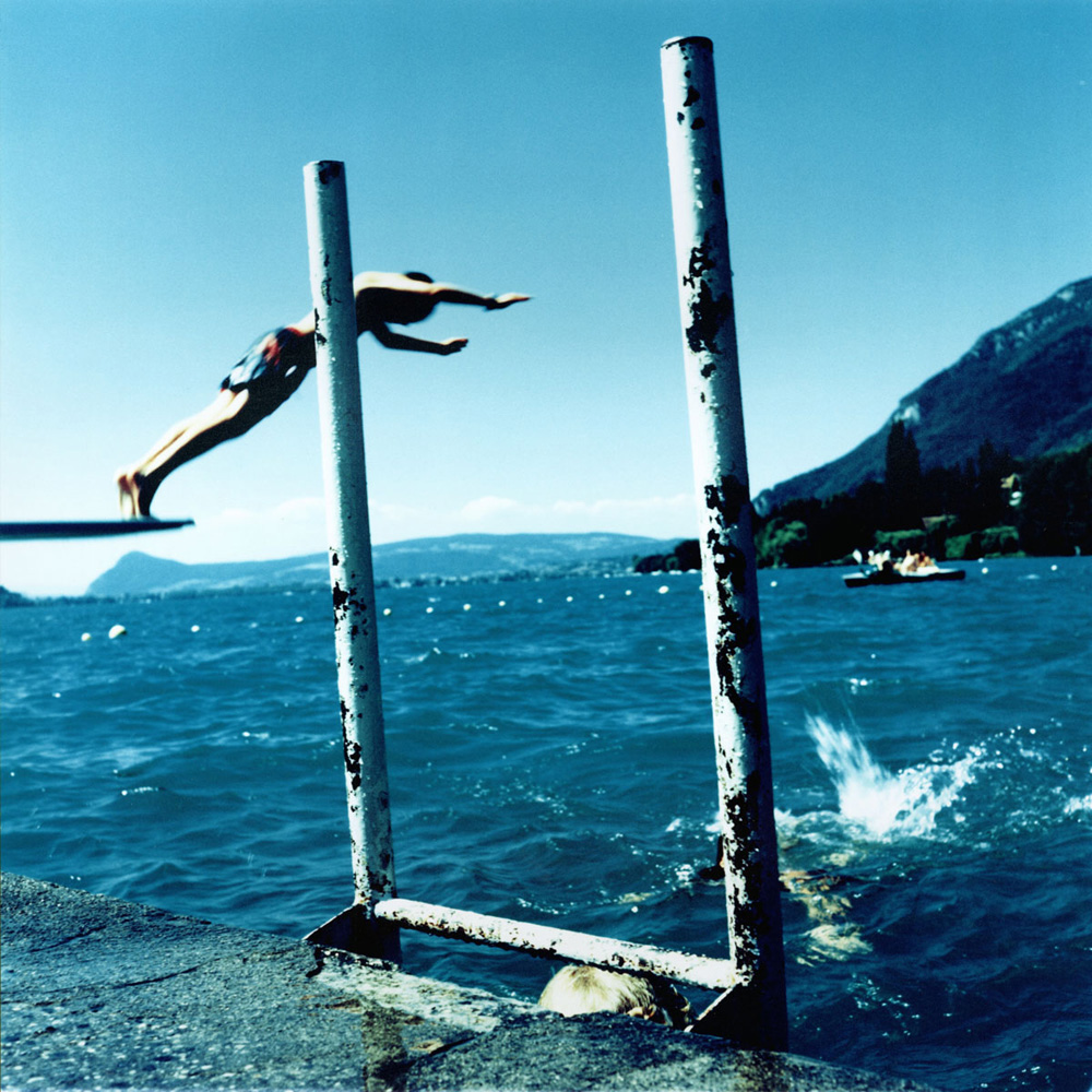
Untitled #18, The Pool, Annency, 2005 – Karine Laval
I began photographing swimming pools in 2002 with The Pool series, focusing on both man-made and natural public pools across Europe. I’ve always been drawn to water and its edges—an element that is central and ever-present in my work. I see water as calming, healing, and liberating—a powerful symbol of transformation, renewal, and self-reflection.
When I started the series, I found myself revisiting memories from my childhood—especially the old Super 8 films my father and grandfather used to shoot during our summer holidays. Traveling to both familiar and unfamiliar vacation spots around Europe, I explored those memories by capturing the playful and sensual relationship we have with water, heat, and the fleeting euphoria of leisure.
This particular image, taken at Lac d’Annecy in France, holds special meaning for me. It’s a place I visited as a child while staying with my uncle and aunt who lived there. I remember the time spent with them clearly, and I also vividly recall the day I took this photo—more than 20 years later—on another hot summer day, finding that same exhilarating, cooling escape in the lake.
RK – I first saw Karine’s work selected as ‘One To Watch’ in Photo District News in 2005. I contacted Benrubi Gallery in New York, who were representing her, to see if I could bring over her first major series ‘The Pool’ to exhibit at the gallery. They said yes, and that was the beginning of an 18-year relationship with her! I adore this series, and it felt like a major milestone in the direction I wanted to take with the gallery – showing quirky, unusual but accessible images – which represented the kind of photography I wanted the gallery to champion. I could have picked any, but this one was probably my favourite from the exhibition, blues upon blues upon blues!

Telecom Italia, 2005 – Morgan Silk
Sometimes you can work hard searching for a shot and sometimes an image just finds you. Back in September 2001, I was lucky enough to spend a couple of weeks in Tuscany and while walking around the seaside town of Castiglione della Pescaia I just happened by the telephone box on the beach. Unplanned and without a narrative in mind I just stopped for a second, shot a couple of frames and walked on. A spontaneous moment captured almost by chance which I’m proud to say has made one of my best images
RK – This is one of the most enduring pictures we have ever shown at the gallery. It made its first appearance at one of the gallery Eclectica end of year shows and has been a staple of our art fair showings for the last 10 years continuing to beguile audiences with its clever framing, seductive colours and intriguing figures seen through the glass of the phone booth. I have always been taken by images taken through windows, harking back to the NY scenes of the great Saul Leiter. A beautiful piece of photographic story telling.
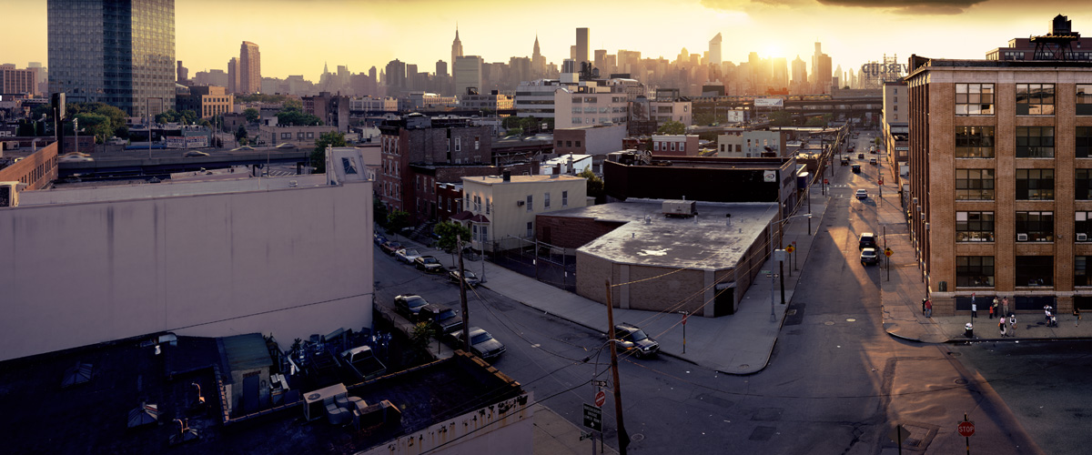
42nd Road, Long Island City, 2005 – Jeff Chien-Hsing Liao
“In Long Island City, the past two decades have witnessed relentless transformation. Where once stood industrial relics and quiet riverfronts now rise glass towers, construction cranes punctuating the skyline. My project, Habitat 7, reflects this accelerated metamorphosis, capturing shifting streetscapes and the evolving interplay of architecture, light, and community. This body of work documents the tension between progress and displacement, the resilience of human habitats within a landscape increasingly defined by corporate ambition. As old warehouses give way to luxury condos, Habitat 7 invites viewers to contemplate what we lose and what we create when a city’s identity is remade.”
RK – An incredible series of pictures from Jeff Liao, published as ‘Habitat 7’, which I was thrilled to show at the gallery alongside works by Christoph Morlinghaus in a 2008 exhibition entitled ‘Visions of America’. An ethnographic photographic travelogue of life running from New York City’s centre to its outer lying boroughs celebrating its colour and diversity. A thoughtful, considered, beautifully-executed project. I love the early morning light bathing this ordinary, outlying neighbourhood of New York and turning into a dreamscape of the city.
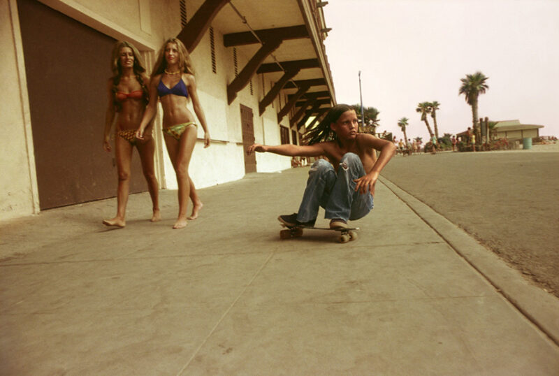
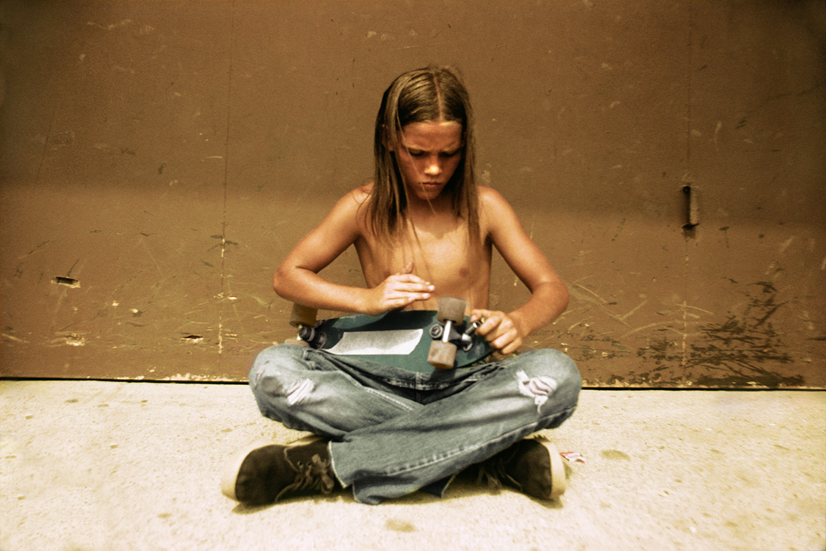
Sidewalk Surfer, Huntington Beach, 1976 – Hugh Holland
I love these images more and more as time goes by. The work that I did during that brief time now looks to me like something amazing. A huge pile of beautiful images. Little did I know that what I was doing then, just because it was there and it was fun, would now be such an attraction. I was in the right place at the right time. There was nothing like it before or after for someone like me that appreciated and loved the look of it all. And it was the incredible energy and the beauty that was generated by the kids that drew me in. I feel that that was a brief moment – it was like the beginning and the end. It spread like wildfire all over Southern California. I know it happened in other parts of the world too, but California felt like the centre of it all then.
RK – I think definitely one of the most exciting exhibitions we ever put together, back in 2007, only the second ever, and first European showing of Hugh Holland’s era-defining skateboard series, Locals Only. We were able to put on the show thanks to the good people at M+B Photo in LA and with the support of Vans in the UK. Hugh came over for the opening and some press events, and we probably had the biggest turn out for any show we ever put on. The exhibition drew photography and skateboard fans from far and wide, and this image epitomises everything that is right with Hugh’s work – great composition, Kodachrome colour and a fuck you attitude. Hugh passed away last year, but his images will live forever.
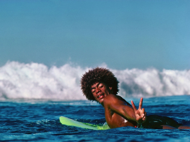
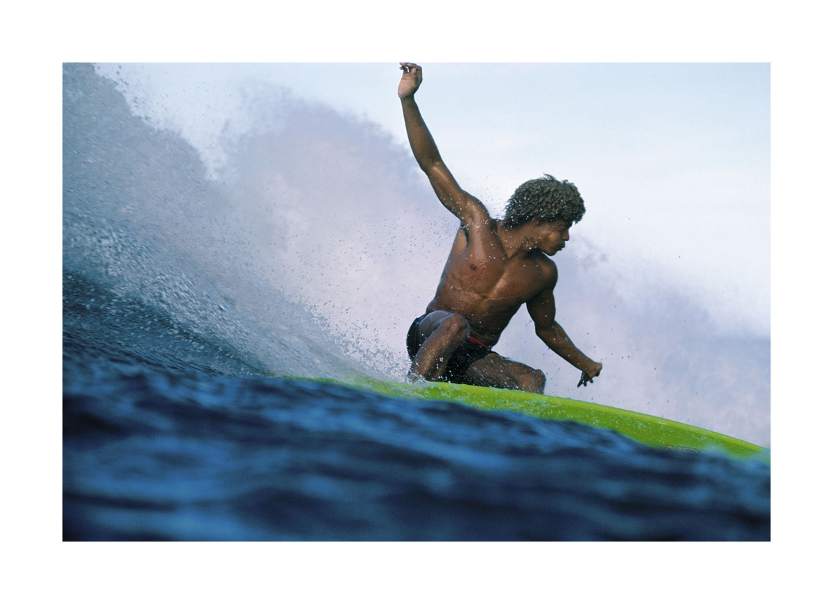
Buttons Kaluhiokalani, Velzyland, Oahu, Hawaii, 1974 – Jeff Divine
I had negotiated my way outside through a narrow channel cut in the reef. I situated myself on the edge of the reef near a crowded lineup of local surfers all clamouring for each wave. I heard a burst of swearing on the inside from a mohawk haired surfer, f bombs, mother fuc***, I’m gonna kick your ass etc. At that moment Buttons paddled by me leaning back at the aggressor laughing, “Peace bro” The crowd all laughed. The day played on 135mm lens manual focus, Kodachrome 25 film Nikon, Hydrotech water housing.
RK – Another marquee show for the gallery was the first ever exhibition outside of the US of Jeff Divine’s ‘Surfing Photographs from the Seventies’ in the Summer of 2008, again courtesy of M+B. The show oozed effortless Californian and Hawaiian cool, epitomised by this sumptuous photo of the legendary surfer Buttons Kaluhiokalani, who sadly passed last year. The water’s eye view, the splash of green board, the grace and poise of Buttons in full flight. It doesn’t get better than that.

Poolside Gossip, c.1970 – Slim Aarons
Arriving in Palm Springs in January 1970, Slim Aarons was tasked with producing a series of shots for Holiday magazine. After photographing a number of high profile figures including famed writer Truman Capote and industrial designer Raymond Loewy, Aarons knew he couldn’t leave town without a pool shoot. Reaching out to his good friend Nelda Linsk, he asked her to invite a few friends over for an impromptu daytime party.
Owned by Linsk and her husband Joseph, Kaufmann House was the idyllic setting of this gathering — a modernist house designed by renowned architect Richard Neutra in 1946, a building widely regarded as one of the most architecturally important houses of the 20th Century.
For two hours Slim documented Nelda and her fashionable friends as they casually gathered around the pool, to produce a series of photographs that have come to represent the epitome of 1970s luxury lifestyle. The image has all the hallmarks of Slim’s great photographic adage: “attractive people, doing attractive things in attractive places”.
Recognised as the most iconic image from the series, “Poolside Gossip” has ingrained itself into popular culture, becoming an everlasting symbol of style and modernism, and has influenced designers and artists over many years.
RK – Wow, what a reaction we had to Slim’s work! We put on the first ever show of his work in the UK in 2008, not long after he had passed away through the auspices of Getty Images who had acquired his archive. We had this picture printed large in the gallery window for the exhibition. It epitomises everything that appeals in his ‘Poolside’ images – the colour, the style, the house, the mountains, the pool. It was all there! Probably the best-selling single image in the gallery’s history.
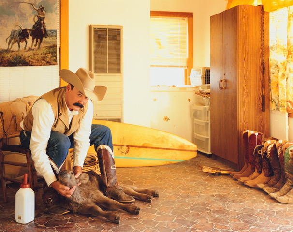
Jason Pelham, Cowboy and Surfer, Spade Ranch, Canadian, Texas 2009 – Jane Hilton
The most unique of all the cowboys I met was Jason Pelham, who was also a surfer. In the winter, he would bring young abandoned calves into his home and hand feed them until they were fit enough to survive on their own. In the summer he would surf the river behind his ranch! A lot of cowboys have never even seen a beach, some can’t swim, so to be a surfer was completely one off!
RK – The gallery exhibited Jane Hilton’s wonderful ‘Dead Eagle Trail’ series in 2010. It was great to work with Jane and show this fascinating series of images, a true portrait of a little-known disappearing community, exactly the sort of project I was drawn to when planning to open the gallery, having first fell in love with photography from looking at photo essays in picture stories in the colour supplements of The Observer and The Sunday Times in my family home as a child. I could have selected many images from this series, but this one really showed the incongruity of the one dimensional, outside view of the ‘macho’ cowboys, with Jane’s real depiction of a sensitive, caring man hand-rearing calves in his home and a surfer to boot! As any great photo story should it takes us behind the obvious to something much more unexpected.
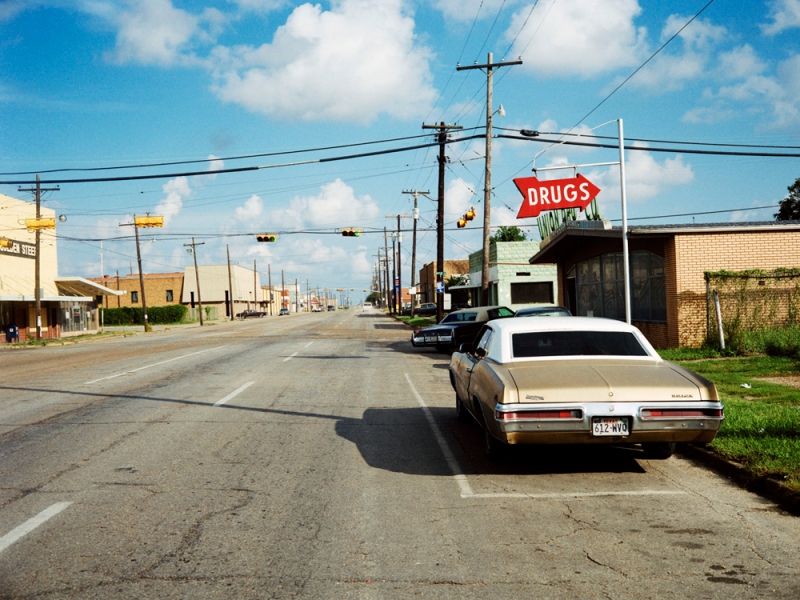
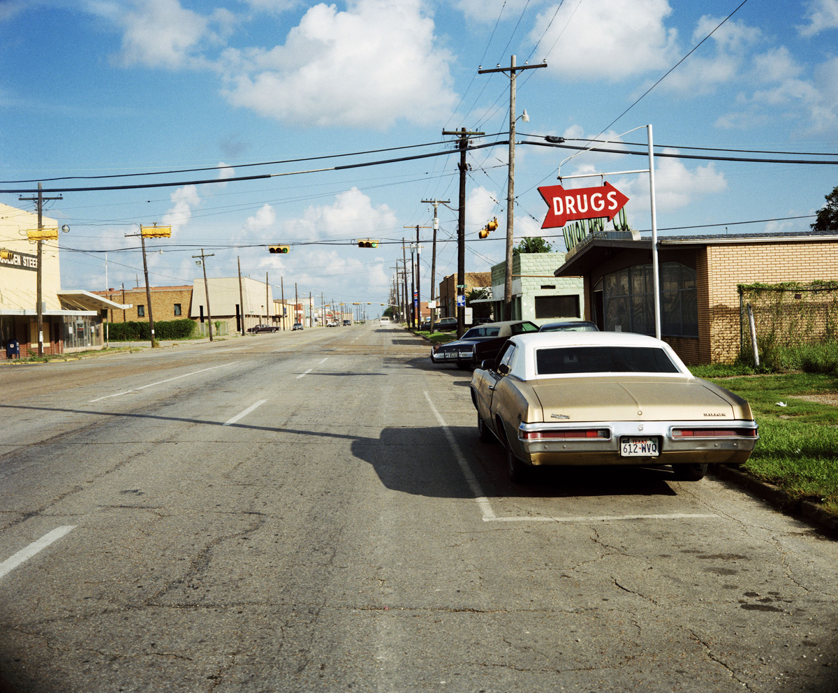
Drugs, c. 1989 – Michael Ormerod
One of my favourite images features the iconic ESCO ‘Drugs’ sign. With its vivid colours, it captures a slice of small-town America that feels both timeless and fleeting. I’m especially drawn to its quiet stillness, a moment of pause that reflects everyday life while making it feel subtly unfamiliar. There’s a gentle invitation to look again, to stay with the image a little longer. I find it particularly compelling when shown in contrast alongside a second photo taken on the same street during a rainy day.
RK – Shown as part of the Brighton Photo Fringe in 2010, I had first come across Michael Ormerod’s work by chance, finding a copy of his posthumously produced book ‘States of America’, in a second-hand bookshop along the road from the gallery. I was captivated and tracked down the archive to Millennium Images and jointly hosted the exhibition with them. A once-in-a-lifetime find for me, an artist with vision, empathy and something profound to say about the human condition. It’s a real honour to continue to show his work, now alongside Michael’s daughter Ali. This image has become emblematic of the humour and pathos that he captured in scenes of small-town American life.
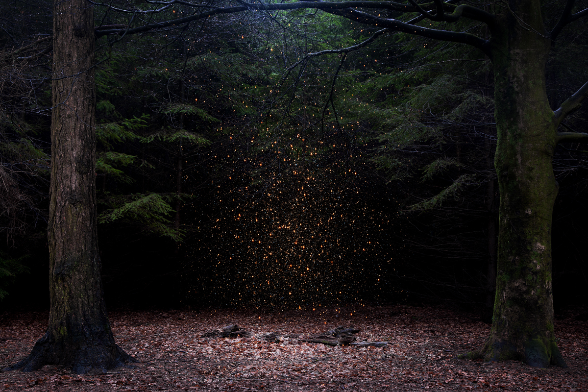
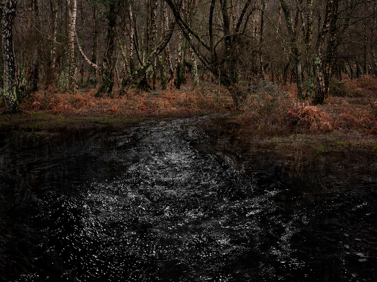
Stars 8, 2013 – Ellie Davies
Experimentation is a central part of my working process. I bring images and sculptural elements together, often using an unplanned and haphazard process, layering, building, gathering and making; compiling the raw materials of a series and bringing them together in the making and editing process in a way that often surprises me. Fundamentally I am trying to capture how the woods make me feel and I endeavour to show this in my images in a way that other people can also experience. I love the freedom of not being sure where a series is going, trying to stay open to the suggestions of the landscape I’m working in.
Stars 8 was shot in the New Forest in heavy rain. The trunks of the trees glistened and blackened by water so that the moss stands out vividly on the surface. The low and gloomy light making the background drop away to deep shadow.
The greatest joy in photography and the creative process is the wonderful feeling of certainty when an image is saying exactly what you had hoped and visualised in your minds eye whilst also containing that magical synchronicity of creativity, where planning and spontaneity come together. Every series usually has one image that particularly exemplifies this for me, in the Stars series # 8 is that image.
RK – A distillation of Ellie’s woodland work – magic, stardust, darkness, light, nature, life, death, eternity. We started working with Ellie back in 2009 when she approached the gallery with an exhibition proposal of her and some of her graduating cohort from the Photography MA at LCC.
Even then with her graduation pieces, Ellie’s work really stood out and it has been a real privilege to work together since that time and see her evolution as an artist and the growth in her career and renown over these last 15 years. ‘Stars’ was the series that elevated Ellie’s work to another level and connected with audiences in a really big way, and this image in particular was incredibly well received. We could have sold the edition many times over!
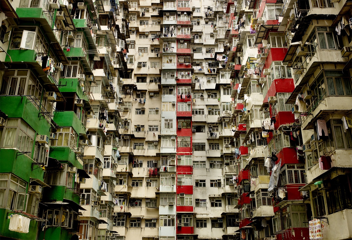
Hong Kong Apartments II, 2013 – Chris Frazer Smith
In 2011, I travelled to China shooting for HSBC and ended up in Hong Kong scouting for buildings and came across the Yick Cheong Building, titled Hong Kong II, which led to a series of urban landscapes shot mainly on Hong Kong island but also on mainland China. Hong Kong II was a location that revealed itself to me as I stepped into the courtyard surrounded by apartments. Despite its apparent simplicity, composing the scene was a challenge. I trusted my instincts, carefully framing the building without resorting to wide angles or long lenses.
RK – We first showed this image as part of a collaboration with the much-lamented HOST Gallery. We had a great reaction to it, and it became a favourite for audiences at a number of art fairs. One in particular, at the London Art Fair, where coincidentally it was being shown under the same roof as a not-dissimilar image by the great German photographer Michael Woolf. I think we benefitted massively from the ‘double exposure’ and a lead image in The Independent Magazine. A great combination of form, colour and composition, beautifully executed with so much to see, rewarding viewing after viewing, always something new to discover.

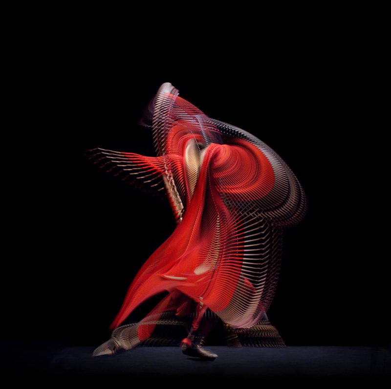
Abstract Dancer, Red 3, 2019 – Giles Revell
Collaborating with Royal Opera House comes with very high artistic expectations. Walking through the corridors of the Royal Opera House in Covent Garden, the walls are lined with iconic dance photographs transcending decades. My remit was to establish an alternative way of capturing the movement and the emotion of dance.
The gravity of such a task filled me huge excitement combined with apprehension. However, a sense of fear channels your knowledge and fuels your creative core. I found Influence in Muybridge and Egerton, two of the pioneers of motion and high-speed photography as well as honing my own contemporary methodology. This was process was tweaked over several weeks and tweaked again until flawless and repeatable. Once presented to the Royal Opera House, the idea was backed wholeheartedly.
A month later I was standing in one of the largest studios in London with the 2 principal ROH dancers directing the work. The imagery is evidence of a bold vision, the importance of time to explore and nurture innovation and the necessity for trust in the collaborative process.
RK – I first saw Giles work at Michael Hoppen’s Shine Gallery when he exhibited his extraordinary ‘Insect Tectonics’ series in 2003. So, I was very excited to work with him over 15 years later with his ‘Abstract Dancers’ series. We showed them first at the London Art Fair in 2020 and had a phenomenal reaction to them. A beautiful marriage of science and technology, art and poetry (in motion).
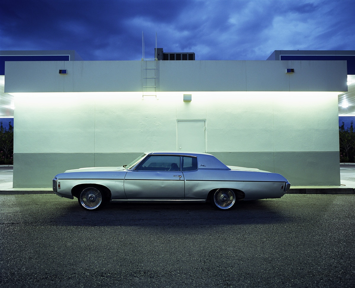
Impala, Las Cruces, New Mexico, 2006 – Samuel Hicks
I captured this photograph behind a petrol station in Las Cruces. I was on a road trip from Houston, travelling around Texas and New Mexico. I was en route to NRAO, the Very Large Array, an astronomical radio observatory that features 27 82 ft arrays, in west of Socorro, New Mexico.I had stopped at the petrol station, and while I was there, I saw the Impala pull in. It was being driven by a man in his late 20s, along with his girlfriend. I struck up a conversation and asked if I could take a photo of their car. They were really cool and happy to oblige.
He asked where, and I replied, “Can you pull up around the side of the station?”
I had my camera on the back seat and set it up on the tripod, shooting about five frames. I remember framing the car so that the lines of the building aligned with the roof of the car. Additionally, as it was dusk, the colour of the sky was reflecting onto the silver of the car, and the colour of the building truly seemed to complement it.I was shooting on an RZ, so I took a couple of Polaroids as well to check how the exposure was working and gave one of them to the couple.
One of my favourite images from the trip, this photograph ranks among the top five I’ve captured during my travels. Before heading to Texas, I immersed myself in the works of Robert Frank, Stephen Shore, Joel Meyerowitz, and William Eggleston. As I was capturing this image, I couldn’t help but think that this scene was something these photographers would appreciate.
RK – We first showed Sam’s work in a solo show ‘On The Way’ in the gallery in 2009. A young exciting British photographer, exactly the sort of artist the gallery wanted to champion with a beautiful, cinematic series from his travels across the US. We showed this print at an art fair in 2012 and sold the whole edition! A first, never, unfortunately, repeated. Striking colour, gorgeous light, scenically staged, it felt like a still captured from Nicolas Winding Refn’s classic ‘Drive’.
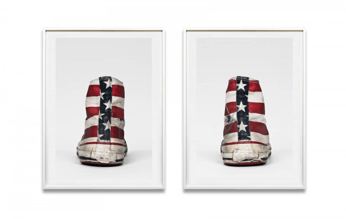
Converse, Stars & Stripes, 2002 – Michael Schachtner
In “Till Death Do Us Part”, the iconic Converse sneaker is elevated from mere footwear to a raw, visual manifesto of lived experience, rebellion, and cultural identity. Each pair is more than a fashion statement, it is a portrait, a diary, and in many ways, a tombstone of individuality worn down by time, movement, and purpose.
This series pays tribute to the people behind the shoes, those who walked their own paths, who challenged norms, and who made the ordinary extraordinary. The battered soles, frayed fabric, and faded logos are not signs of decay, but evidence of life fully lived. Converse are not pristine objects; they are lived-in vessels of defiance, loyalty, and memory.
One particularly resonant work features a pair of American flag Converse, weathered and worn to the core. Here, the stars and stripes aren’t just symbols of patriotism, but of paradox – a reflection of both freedom and friction. Converse, with their roots in basketball and eventual adoption by punks, skaters, grunge icons, and social outsiders, symbolize America’s parallel narratives: opportunity and protest, unity and discontent.
In the current social and political landscape of the United States these shoes take on new weight. They embody a generation’s refusal to conform, their struggle to be heard, and their fight to remain authentic. In this fractured American dream, even a sneaker can stand as a symbol of resistance, wear, and unwavering spirit.
By capturing them in stark portraiture, these Converse are no longer just remnants of style, they become relics of self-expression. Until they fall apart. Until death do them part.
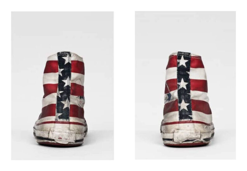
RK – Sometimes the simplest idea….a wonderful one concept series that also speaks so much to the human condition all through the emblematic symbol of a pair of Converse boots. Identity, individuality, rebellion, tribalism and much more all expressed through customised trainers. Michael’s work has been a staple of our art fair showings over the last 10 years. These were the first pair of prints ever shown and my favourites of the series.
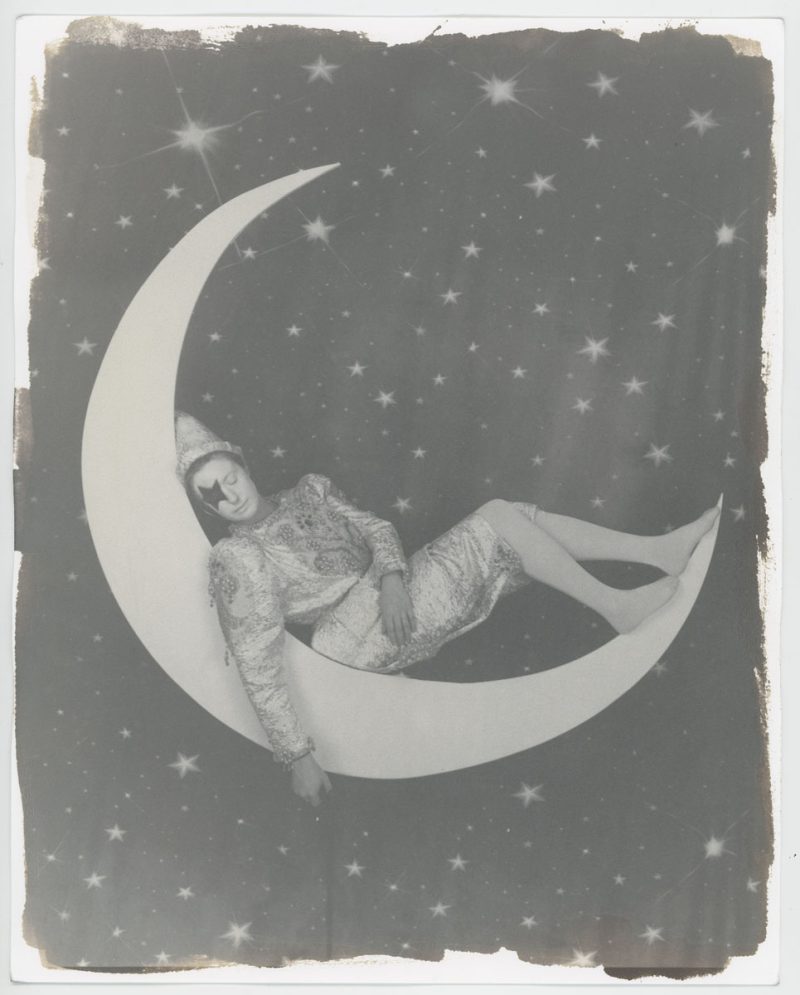
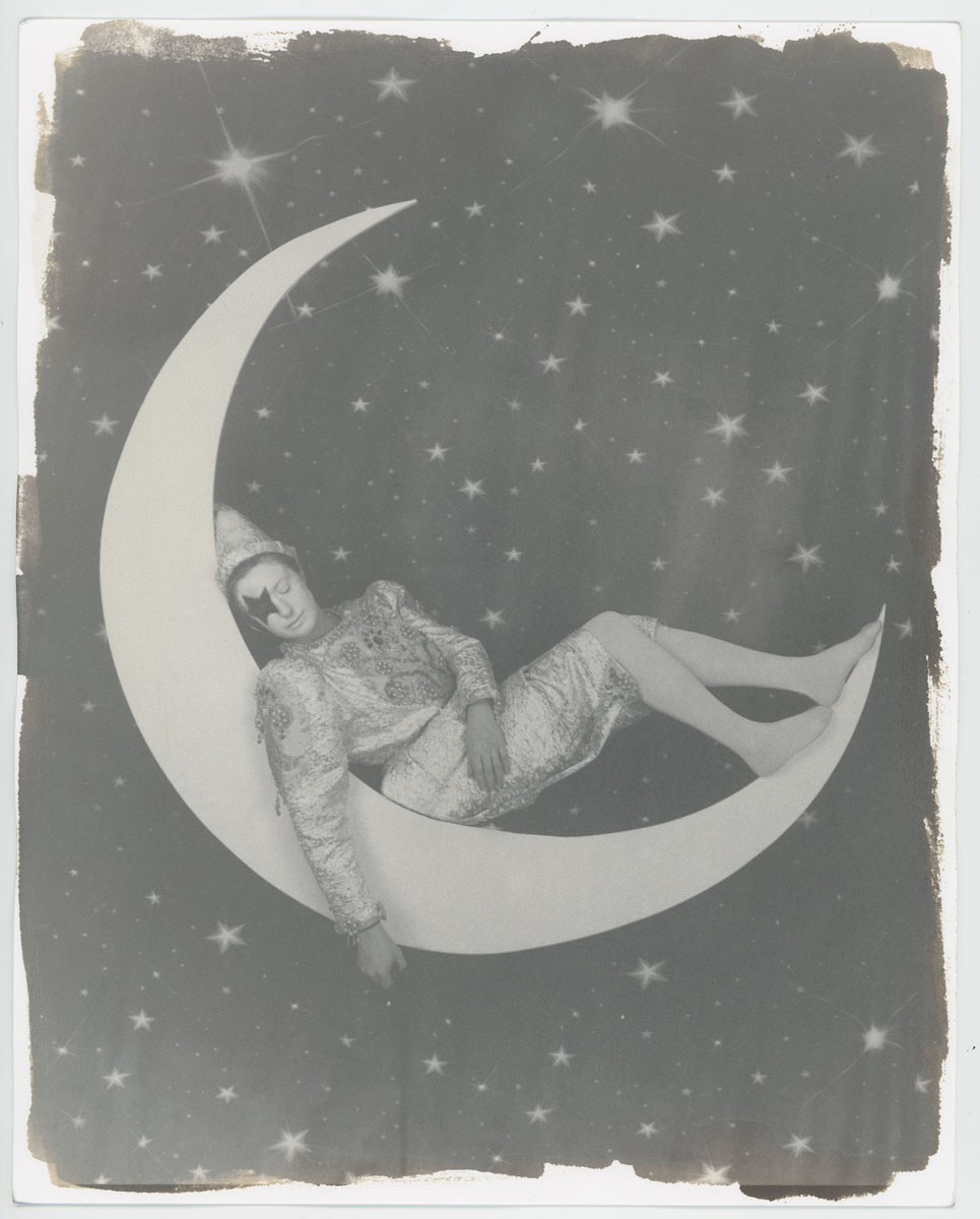
Untitled #62, Salty Clowns, 2020 – Rachel Louise Brown
It’s a joy to celebrate 20 years of a gallery that has consistently championed photography with heart, imagination, and risk. I’ve always felt held here – supported to experiment, to play, and to dig deeper. The Salty Clown series was created during the pandemic, a time when the world felt uncertain and inward-facing. I was looking for ways to reconnect with joy, playfulness, and absurdity – and also with photography itself, at its most elemental. I began teaching myself the salt print process, one of the earliest and most delicate photographic methods, drawn to its slowness, its imperfections, and its tactility.
The portrait where I sit on the moon in a borrowed clown costume – an original from the Clown’s Museum – felt like a strange dream made real. The costume reminded me of David Bowie, that blend of theatricality and vulnerability. It became a meditation on persona, humour, and quiet resilience.
That the series was so warmly received at Photo London was incredibly moving. It affirmed something I’ve always believed: that people respond to work made with care, courage, and a little bit of magic.
RK – Something of an anomaly in this selection, Rachel’s ‘Salty Clowns’ series was both a fascinating, and for the gallery, a rare excursion into artist’s working with alternative processes, in this case, the beautifully seductive but dangerously complicated world of salt prints; married to a story of the powerful hold of the need for creativity even under the most uniquely difficult of circumstances experienced during the pandemic. Rachel’s work spoke of how an artist’s need for expression will overcome the most formidable barriers and can even possibly channel that creativity to reach greater heights and the urgent need to explore the genuine magic of the alchemic processes of photography.
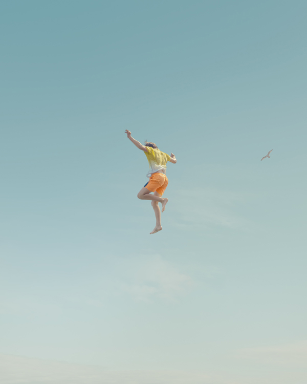
Into the Sky 6, 2023 – Andy Lo Po
It was July 2022, and after two long years of restrictions, Covid finally felt like a thing of the past. That summer in southern England was scorching, and as I cycled along the seafront in Brighton and Hove, something caught my eye: people launching themselves off a massive groyne into the sea. They weren’t simply jumping – they were soaring, hanging almost suspended in midair before plummeting into the cool water below. I was immediately captivated and decided then and there to return the next day, camera in hand.
When I came back, I spent the first couple of days experimenting – searching for the ideal vantage point and experimenting with camera settings. I waded chest-deep into the water, shooting test frames, then cycling back home with my camera each evening to review them. I became fixated on a low-angle perspective that framed each person suspended in midair, evoking something almost angelic or divine, yet unmistakably rooted in simple summertime joy. Once I knew that this was the composition I wanted, I made my plan to return for the real shoot on the following day.
That day happened to be July 19th – the hottest day on record for the region. The heat was palpable: beachgoers flung themselves off the groyne with total abandon, as though finally liberated from the tensions of the past few years. I waded back into chest-deep water, camera poised, and for hours I captured a continuous procession of people spinning, diving, and dangling in midair before splashing down. One of these images featured a person with open arms that seemed to perfectly encapsulate the entire “Into the Sky” project in just one picture – where time and gravity seem momentarily paused.
RK – I love this series. They are a joy! Playful, superficially simple, but incredibly cleverly created and captured, a paean to the joy of being human, to being free, to the heat of the Summer, to my home – Brighton beach! We have never had a better reaction, or more sales, to a series of work shown ever.

Monterosso, Cinque Terre, Italy 2020 – Nick Meek
Cinque Terre is a string of centuries-old seaside villages on the rugged Italian Riviera coastline. In each of the 5 towns, colourful houses and vineyards cling to steep terraces.
After the first challenging lockdowns of 2020 I was interested to see how tourism would re emerge in this remarkably beautiful place so I packed my field camera and took a hike along the Sentiero Azzurro cliffside trail…. A footpath that links the five villages.
It’s no secret that this part of the Liguria region suffers from being overly touristed but what I experienced during this time was exactly the opposite….. Gone were the huge cruise ships that tower over the coastline like floating skyscrapers. Gone were the packed trains that deposited eager tourists at the brink of vertiginous steps that wind down the cliffs to these little villages. I barely saw another hiker on the Sentiero Azzurro trail that is usually nose to tail with people. It was exactly what I hoped to find.
As an artist my work is closely linked to memory and emotion so to witness this kind of landscape in a way that it perhaps looked in the 1950’s or 60’s… just before mass tourism and certainly before the cruise ship arrived was real gift. It’s said that the act of photographing is inextricably linked to time….The shutter opens just long enough for light to hit the ‘film’ and your image is saved, a perfect recording of the moment.
In my practice I like to bend this rule. I want to take the viewer on a journey…… Suggesting a memory of a place that they have never been…. Or perhaps give them a recollection of that feeling you get when you first step off the plane. Technically my camera certainly records the reality of a situation, the reactions of people as they enjoy the ocean for example and the framing simply distils a kind of narrative…..Omitting parts of the story left and right in order to show the thing that I want you to see. In that respect the image is always an honest one. The work in producing the final print however is where the layers of colour can suggest a different story.
The Monterosso work is peppered with colour, leading the viewers eye from person to person. The late summer sun gently flares into the lens and leaves a layer of haze over the image so the final piece is somehow less of a document and more of an interpretation.
RK – Bringing us right up to date with our 20th image is Nick Meek’s ‘Monterosso, Cinque Terre’, 2003. It is one of those images that just chimes with audiences, right image at the right time, and people really fell in love with this work (and Nick’s work in general). I think the ‘simplicity’ of this image, in many ways like a later day ‘Poolside Gossip’, just resonates with people. The light, the warmth, the colours, the heat and haze and the undeniable feel of nostalgia, a connection to Summers’ past, to family holidays on the beach, to a simpler easier hedonism, to a time we all want to retain.
prints Available to purchase
-
Monterosso, Cinque Terre, Italy 2020
-
Untitled #62, Salty Clowns, 2020
-
Untitled #18, The Pool, Annency, France, 2002
-
Converse, Stars & Stripes
-
Into the Sky 6, 2023
-
Jason Pelham, Cowboy and Surfer, Spade Ranch, Canadian, Texas 2009 – Jane Hilton
-
Monica Vitti, on the set of ‘Modesty Blaise’, Shepperton Studios, 1965
-

Abstract Dancers Red 3, 2019
-

Sidewalk Surfer, The Promenade, Huntington Beach, 1975
-
Drugs. c. 1989
-
Hong Kong Apartments II
-
Sidewalk Surfer Pit Stop, Huntington Beach, 1975 (from the series ‘Locals Only’)
-
42nd Road, Long Island City, 2005
-
Buttons Kaluhiokalani, Velzyland November 1974
-
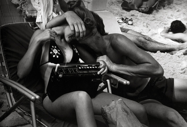
Nuzzling on the Beach, 1983
-
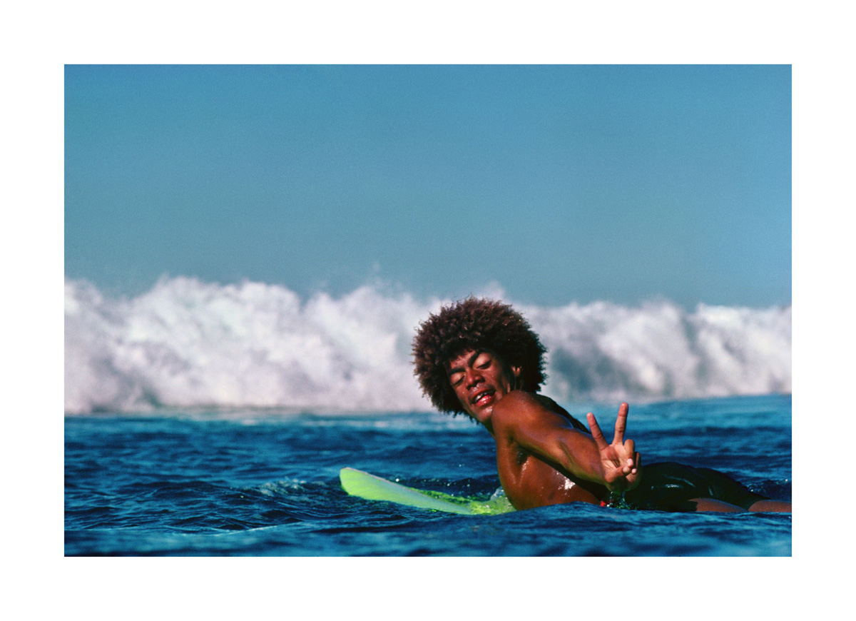
Peace, Buttons, Kaluhiokalani, Velzyland, 1974
-
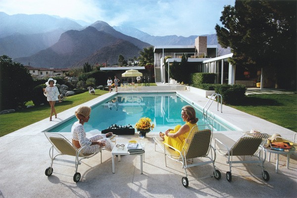
Poolside Gossip, c.1970
-
Priscilla, Jones Beach, 1969
-
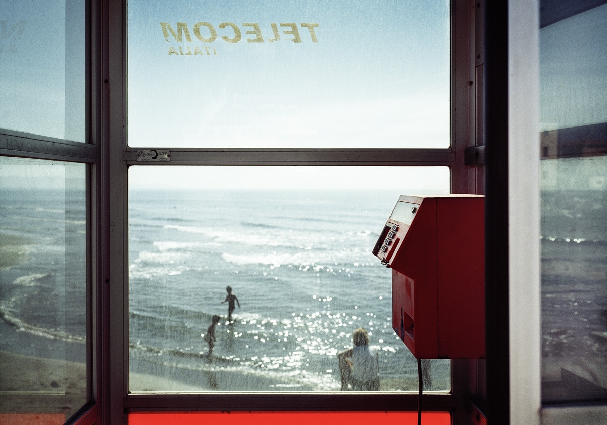
Telecom Italia, 2001
-
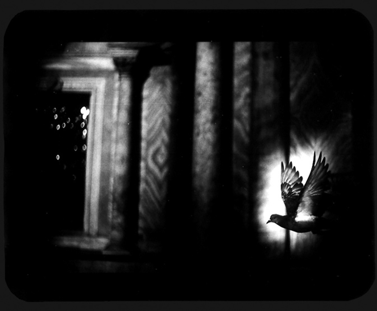
Untitled (Pigeon Venice), 2006, From “The Animals”
-
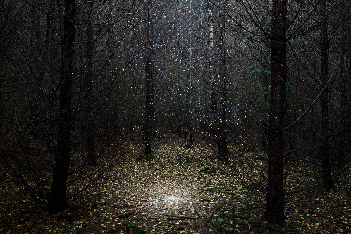
Stars 1, 2014
-
Impala, Las Cruces, New Mexico, 2006
-
Stars 8, 2013
-
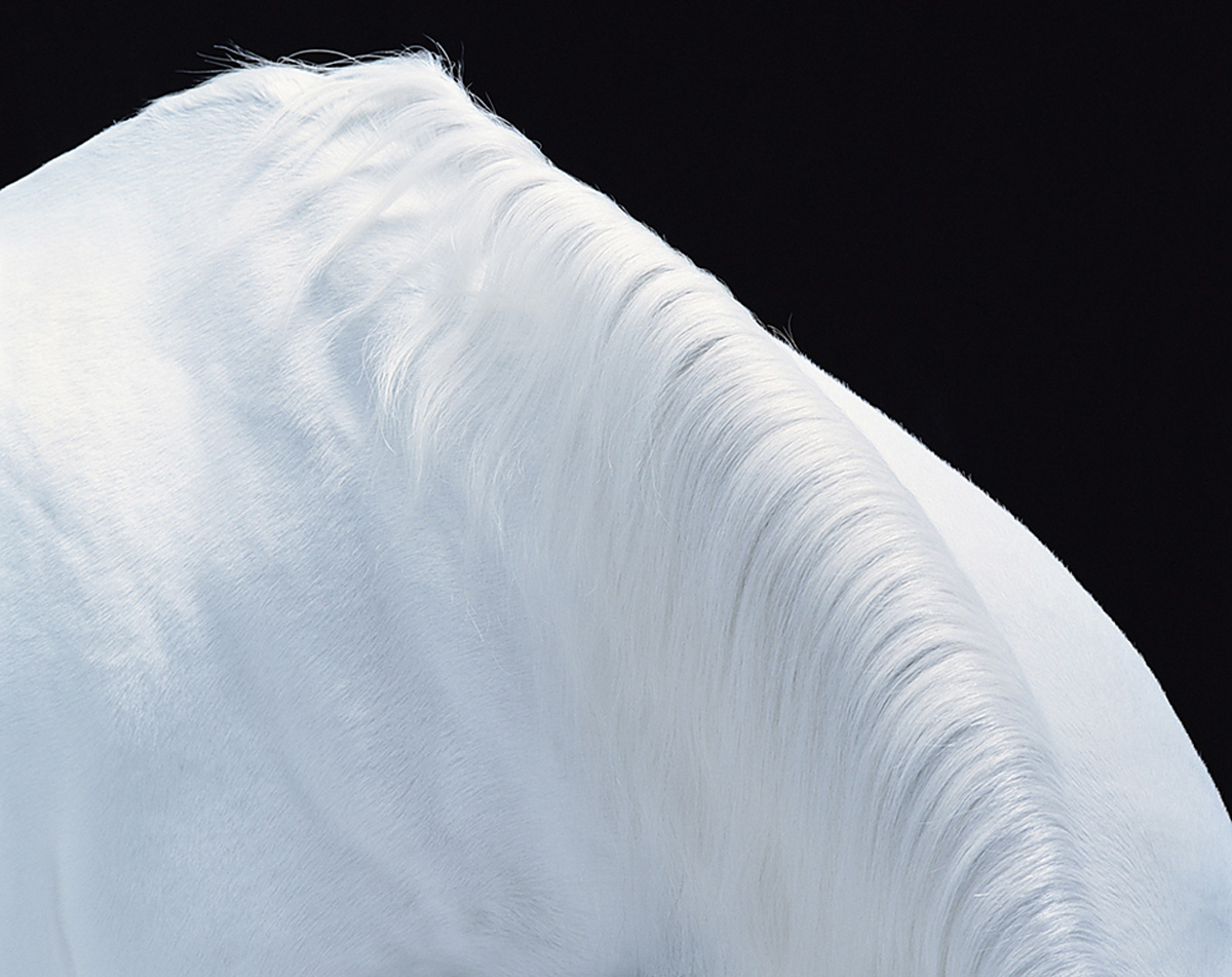
Horse Mountain, 2006
Ellie Davies, Seascape 7, 2020
90 cm x 120 cm, Edition 1/7
Prices starting at £1,200 exc VAT
Also available as:
90 cm x 120 cm, Edition 1/7
Prices starting at £1,200 exc VAT
Ellie Davies, Seascape 8, 2020
90 cm x 120 cm, Edition 1/7
Prices starting at £1,200 exc VAT
Also available as:
68 cm x 90 cm, Edition 1/7
Prices starting at £900 exc VAT
Ellie Davies, Seascape 9, 2020
90 cm x 120 cm, Edition 1/7
Prices starting at £1,200 exc VAT
Also available as:
68 cm x 90 cm, Edition 1/7
Prices starting at £900 exc VAT